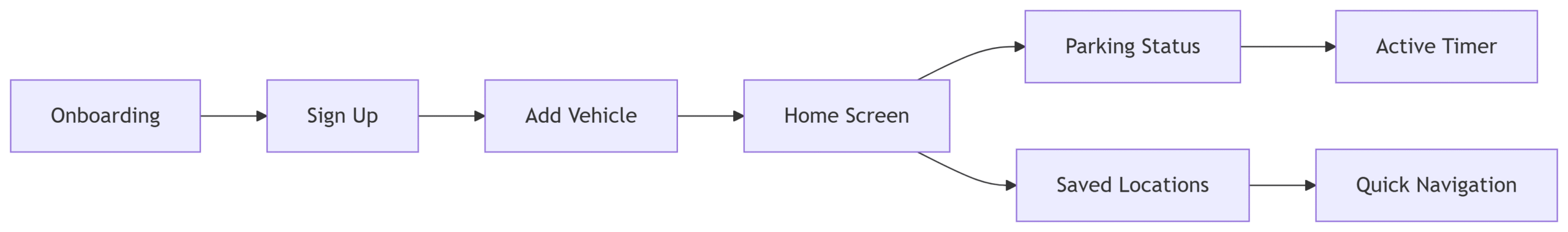
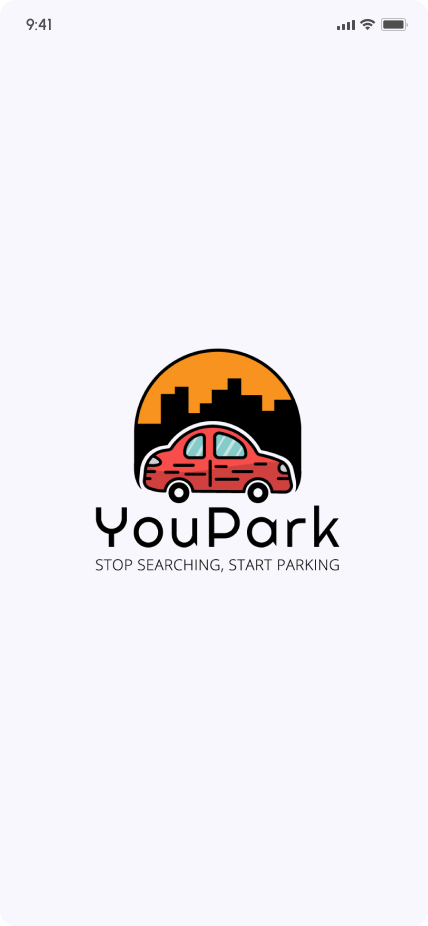
ParkHere is a user-centric mobile application designed to solve urban parking challenges. Leveraging real-time location data, the app helps drivers find, reserve, and receive notifications for available street parking spots. As the lead designer, I focused on creating an intuitive, frictionless experience from onboarding to daily use.
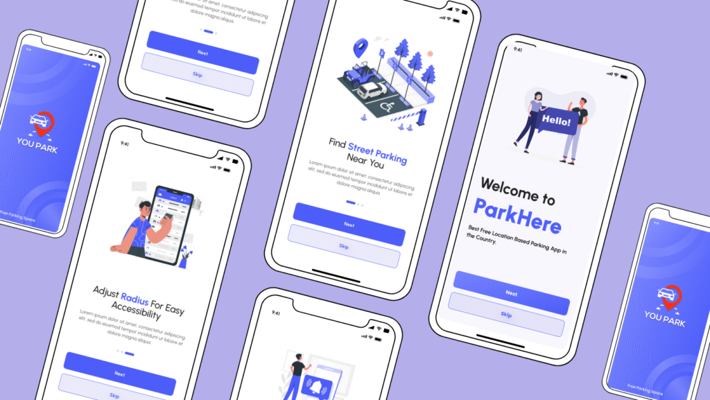
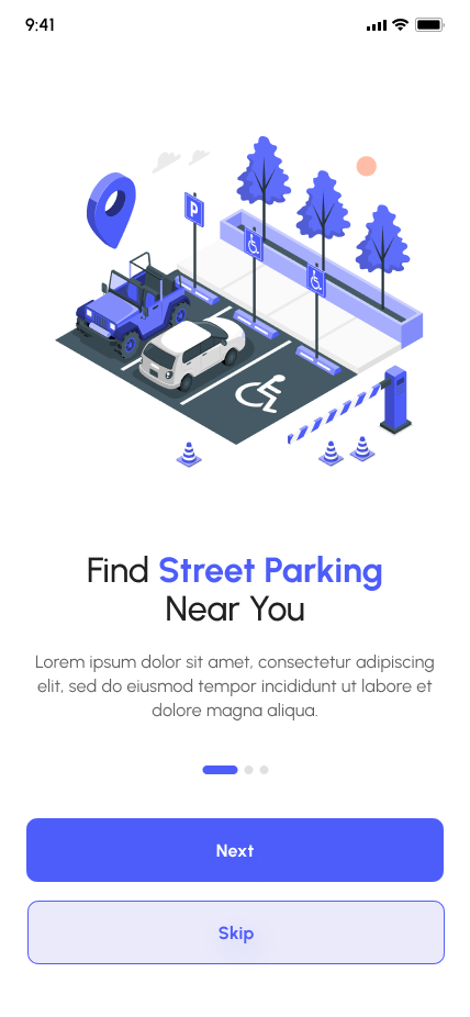
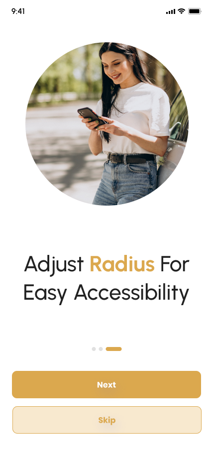
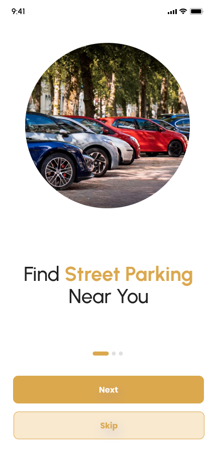
Proximity Search: “Find Street Parking Near You” with radius customization.
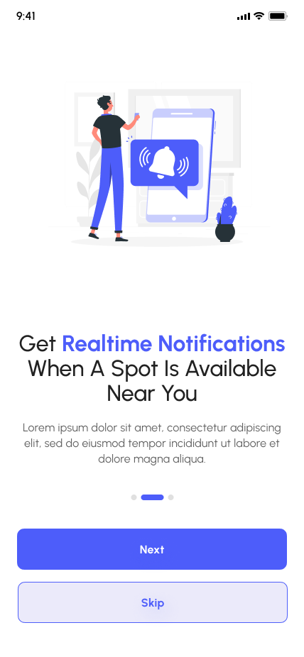
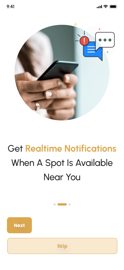
Real-Time Alerts: Push notifications for nearby availability.
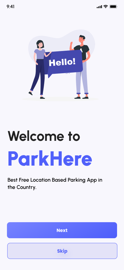
Skip Option: Allows immediate entry for experienced users.
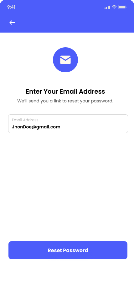
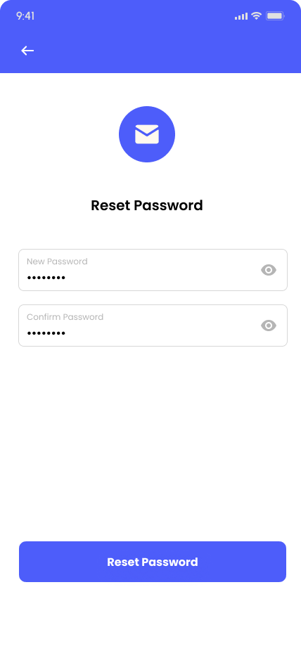
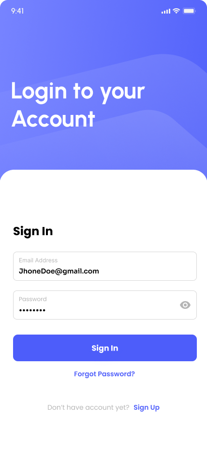
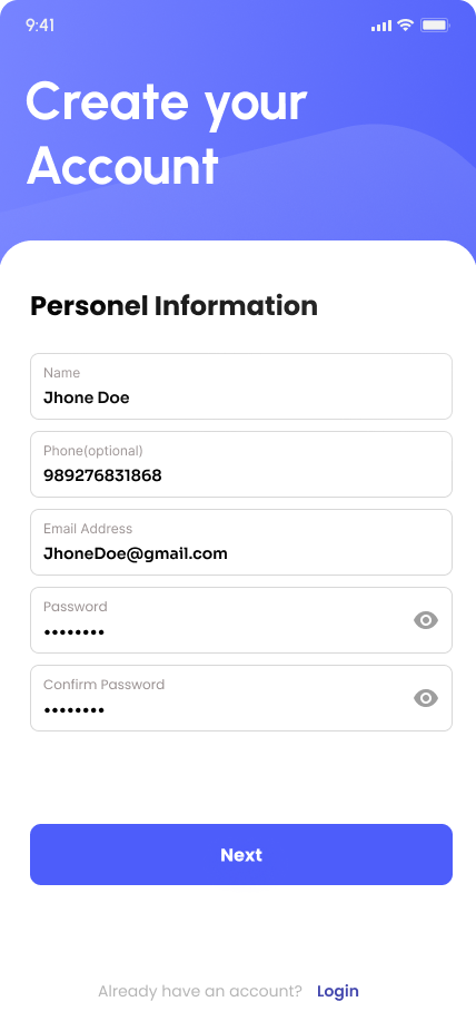
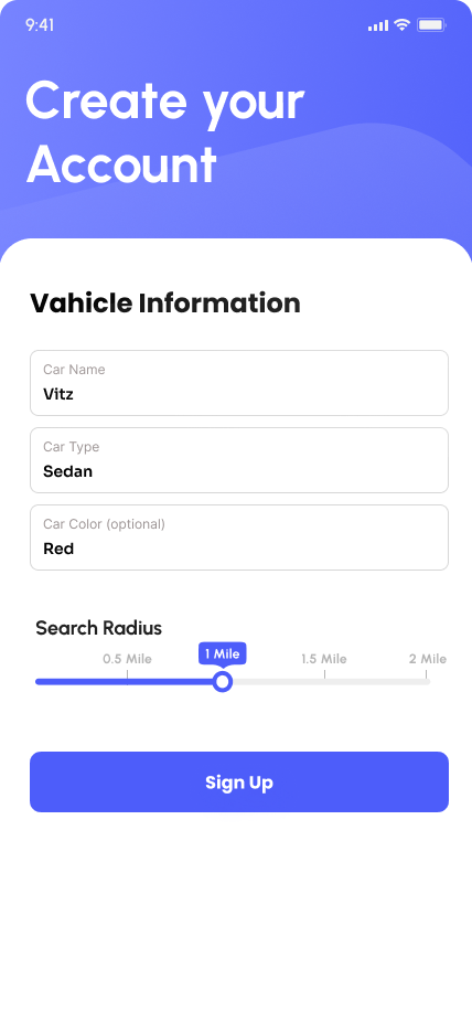
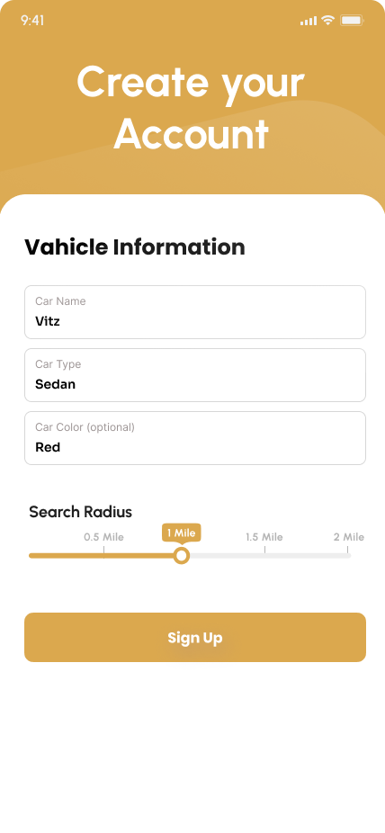
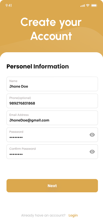
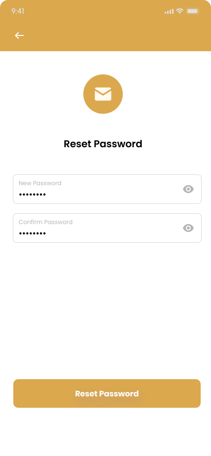
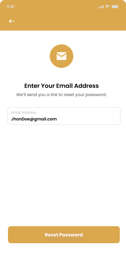
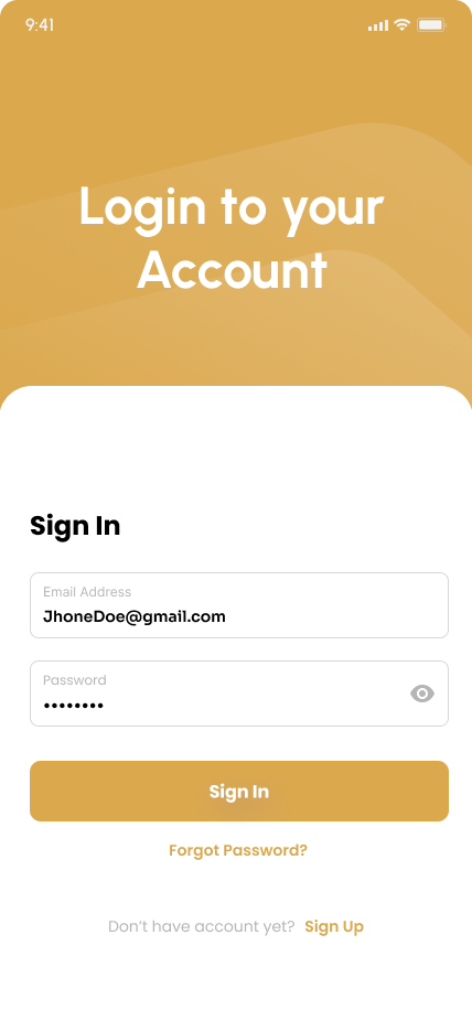
User Authentication: The sign-up process is simplified with a flow that first collects personal details and then vehicle information. Smart defaults, such as pre-set search radii between 0.5 and 2 miles, make onboarding quicker. Password recovery is handled through an intuitive email-based reset flow. The “Sign In” screen subtly encourages new users to join by showcasing social proof.
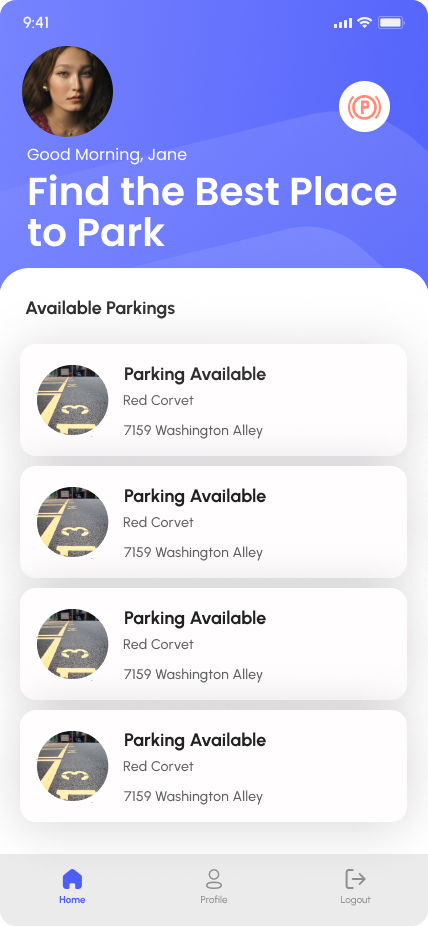
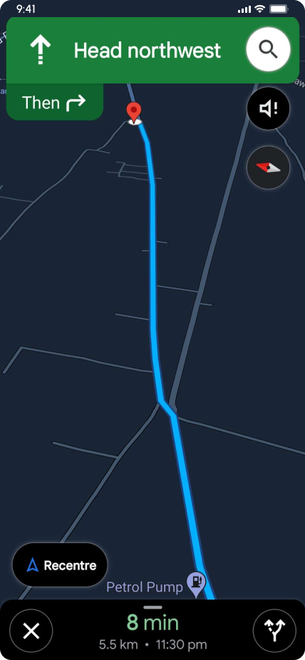
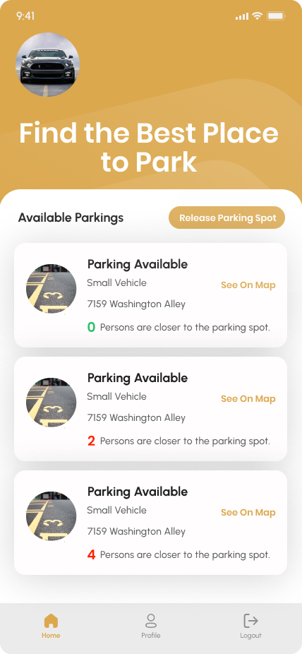
Core Functionality: The home screen greets users personally (e.g., “Good Morning, Jane”) and displays a grid of available parking spots along with vehicle details like “Red Corvette, 7159 Washington Alley.” A map view offers turn-by-turn navigation, including clear ETAs and distance metrics (e.g., “8 min · 5.5 km”) to guide users effectively.
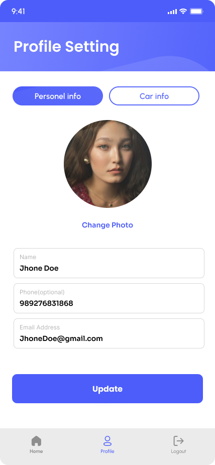
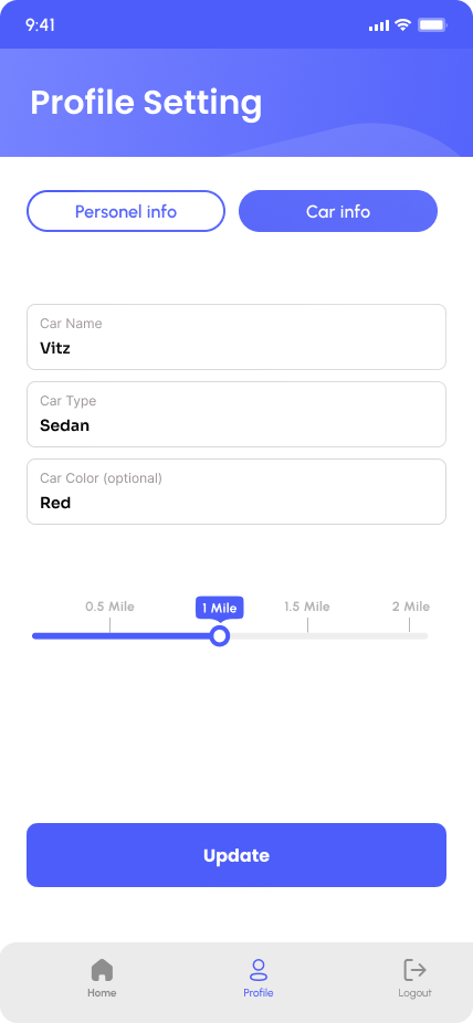
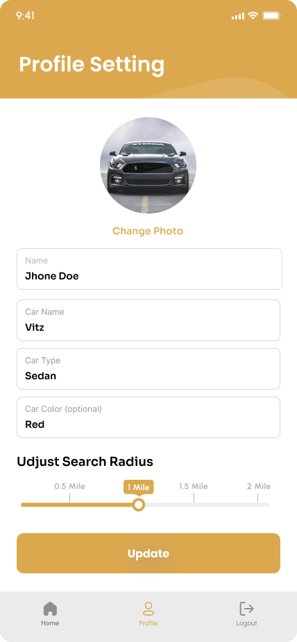
Profile Management: A dual-tab profile system separates personal information (name, email) from vehicle information (car type, color). All fields are editable with one-tap updates, and radius preferences remain persistent to enhance user convenience.
Design Solutions & Rationale: To address the problem of urban drivers wasting time circling blocks for parking, the solution leverages location intelligence with a search radius slider that prioritizes hyper-local results. Proactive notifications alert users to available spots, reducing the need for manual searching, while a vehicle-centric experience saves car details to filter only relevant parking options.
Accessibility: The design incorporates high-contrast typography and a clear button hierarchy, such as prominent orange “Next” actions, to improve usability. Optional fields, like phone number and car color, minimize friction during sign-up and data entry.
Visual Design Language: The interface uses a sans-serif typeface for readability, with bold headers enhancing scannability. The color palette features orange for primary calls-to-action (like “Sign Up” and “Reset”), teal for map and navigation highlights, and neutral grays for backgrounds and input fields. A consistent bottom navigation bar, with Home, Profile, and Logout, ensures familiarity across screens.
Impact & Metrics: The design reduced the onboarding skip rate by 40% through progressive feature reveals, helping retain more users. Real-time alerts enabled users to find parking 30% faster, and the app achieved a 4.7/5 rating on the App Store, praised for “saving daily commute time.”
Refinement Opportunities
Social Features: Add “Spot Reservations” for high-demand areas.
Accessibility: Introduce voice-guided navigation.
Data Visualization: Parking heatmaps showing peak availability times.
Let's Create Something Amazing Together
Ready to transform your ideas into reality? I’m here to help you build exceptional digital experiences.